Wednesday, November 30, 2016

Blog Post #6 Color Pencil Project

Color Pencil Project

Include a copy of the picture you drew from.
Where did you take this picture? 
This photo was taken in Maui, Hawaii. We were at a beach in Kaanapali when I heard people talking to my dad about turtles down at the end of the beach. 
Why did you choose it?
I chose it because it was seeing turtles was the highlight of my vacation and I thought it would be fun to draw.
How did you keep yourself challenged?
I kept myself challenged by choosing a detailed and intricate picture but also by choosing a photo that I would have to tackle the task of blending colors from dark to light depending on the light source.


Include an image of your final project. Make sure the image is not from an angle, blurry, or poorly lit. Download the image and upload in blogger. Do not drag or copy/paste the image in.


Explain your reasoning for the composition you chose.
Since I already took the photo, not specifically for this project, I didn't have much say on the composition. However, out of the many photos I have of turtles from my trip, I chose this one because it shows depth and perception by having a large detailed flipper in the front and two washed out flippers in the back.

Did you create a grid or use your observational drawing skills? Describe one challenge and one success you had while drawing (not coloring) this project as it relates to your technical control.
I gridded my art because with the small details in the neck and area where the flipper meets the skin it helps me focus in on these areas. Another reason why I gridded my art was because in the past I have started a drawing and intended to complete it, however, I drew the first part too big causing the paper to be too small for me to draw the whole thing. 

What color scheme did you choose for your project? How did you establish a time of day or mood? Give specific examples from your work.
I used an analogous color scheme for my turtle. An analogous color scheme is 3-5 colors that are next to each other on the color wheel. This worked out well because my drawing needed mostly blues and greens. Blue and greens are next to each other on the color wheel. In the photo is was daytime and you can tell because the full photo is bright and barely has any shadow in it.

Tell me about a technique you used/created with the pastels or colored pencils that enhanced your work.
In the turtle, there were many places where I need to use a colorless pencil to blend. After I started my project, when I got home I experimented with the colorless pencil. By doing this I found out that the colors blended better when I used a figure eight motion as if I was scumbling 
Explain where, how, and why you used 2 principles of design in your work.
This figure eight motion was the most helpful in the area where the skin wrinkled at the connecting point of the flipper. By using only a certain amount of pressure I could blend and still keep some areas dark. The 2 principles of design that I used were contrast and balance. The contrast is showed mostly in the shell and the front flipper. My contrast was more subtly than usual but showed between the main two different color greens I used. This small contrast made my art so much more detailed. The balance aspect comes in, in a subtle way as well.  By having 2 section with darker areas and a group of the same design on the face and flipper, it ties together and completes the drawing. 
Are you happy with your project? Why or why not? What would you have done differently if you were to do it over again?
I am happy with my art because I took the time to bring it home so I would not have to rush to it. This let me add so much more detail then just doing it at school. Next time I would have found a different way to do the background. It turned out a little more messy then I had hoped but still looks good. I have learned through this project and the shading project that I am a little afraid to use dark colors. If I did this another time I would use a shade of dark blue to go back to the front flipper and add some darker color.

Monday, October 24, 2016

Blog Post #5 - shading project at home

Blog Post #5 - shading project at home


  1. Include pictures of the sketches and completed project you did at home.


  2. What did you choose to draw? Why? Did you keep yourself challenged?

           I chose to draw a lemon. The lemon captured my eye when I walked into my kitchen and my dad was cutting it. I looked for objects to do but I wanted something that would interest me and not just do it because it's mandatory. The lemon was different and has two main components that I was able to draw. This kept me challenged. The exterior of the lemon was hard because I wanted to get the bumpy looking texture.

  3. How did you setup your lighting? Why?

    I focused on one main light source. I did this because I am able to find small details when the light is shining in one place. In the future, I think it would be interesting to try shading an object with multiple light sources.

  4. Was it easier to draw at home or at school? Why? How was it different?

    For me, it was way easier to draw at school. At home, there were so many more distractions than at school. I could constantly hear the TV or was thinking about my other homework. When we draw at school, we have one intention and that helps me focus more. Last year at my art class after school, I was able to get so much more done, then when I tried to at school. Classes specifically for art are so claming and fun and I am just more in tune with my art then.
  5. Are you happy with how your work turned out? Why/why not? What would you have done differently?

    I am happy with the first half of the lemon I drew. The first one I drew was the one on the left. It is the one overlapping the other half of the lemon. It took mutiple days to make sure the details were correct. My second half showed shading however, I think I could have added some more darker hues in the drawing.

Blog Post #4 - Post Shading Projects


1. Response to blog post #3- were you able to achieve your goal to show improvement? Why or why not? Be specific - how, where, etc.

In blog post #3 my main goal was to make sure I did not put one single object in the middle of the paper. In my final drawings, I did multiple objects and chose different compositions. My scissor drawing shows open composition and follows the rule of odds. My popcorn drawing represents closed composition.


2. Upload pictures of the additional projects you created in class and the sketches that went with them. (you do not need to repost the first project from your last blog post).


3. Which project do you think turned out the best? Why? Be sure to mention your composition choice, use of values, light source, and the blending and texture techniques you used when explaining why it was a successful work of art.

I think my scissor sketch turned out the best. The composition is open, which was the first time I had used that kind of composition on purpose. I have done open composition but the other times I did it was because my proportions were off. Now that I know how to use the sighting technique I am able to control the composition. Having one light source helped me capture a lot of detail in the sketch. This was because I was able to tell where all the natural shadows were. Drawing a simple object made it possible to find all the small picky details in the objects. To create the cast shadows in a way that looks realistic I had to use a wide value of shaded pencils. To create darker values I chose the softer pencils, such as 6B. To add the light values the fade out I used the 2H pencil. Overall, the scissors were my favorite and also the most fun to draw.

4. In reflecting on all of the projects you created, has there been a step to the drawing process that has been particularly difficult? Were you able to overcome it as you worked? How? If not, what do you plan to do differently in the future?

I am slowly getting out of my habit of jumping right to the details instead of taking the time to use the technique of gesturing to help me. Although in some final pieces I skipped gesturing, In my popcorn drawing I made sure to gesture. Another aspect that I noticed in my art is that I tend to stay away from really dark values. In my art, I mostly notice medium and light values. I hope to be able to get comfortable with darker values.


5. What is one bigger idea or concept you’ve learned in this process that you think makes art successful?

One idea that will help me in the long run, is just generally learning how to use shading to create the illusion of a 3D image on a 2D surface. That is all thanks to shading. Shading makes art successful because it helps create lights and darks as seen on objects. If shading wasn't part of drawing, objects could look dull and flat.

Thursday, October 13, 2016

Blog Post #3 - Shading Project Midway


  1. Upload a picture of your first shading worksheet. What is one technique that is helping you create blends? What are you still struggling with?

One technique that is helping me create blends is holding far back on the pencil to create lighter hues. When using wood pencils I am able to use the surface area to my advantage. The larger surface area helps to create an even thickness and smooth transition into the next level of shading. I am struggling with making sure I show a full range of values to create contrast throughout the sketch. Another aspect I could work on would be to fully bend out the light values to make sure no harsh lines are showing. 


  1. Upload a photo of your first project and the 3+ sketches that you drew before starting it. Which composition did you choose? Why? What rules does it follow?  Did you remembering to follow the steps to get your proportions correct before contouring? What went well with the shading? What didn’t?
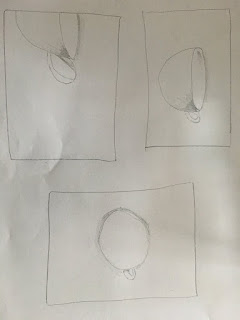
I chose to start with a simple composition and challenge myself as I continued on with my other drawings. By using the rule of odds I was able to create a focal point as well as following the concept of an odd number of objects in the drawing. When starting to draw the cup I think I rushed to process of sighting and measuring. By doing this, the handle was a little of proportionally in my opinion. I followed the rule of closed composition by making the cup fully on the page with room to spare. The part that went well with shading was remembering to make the background darker to create the effect of contrast next to each other. One aspect I will definitely work on is blending out the lines to mellow down the harshness of them. This will create a smoother transition on the outer edge of the cup.
  1. What is one goal you have to show improvement in your final project?

In my final project, I hope to remember to place the main subject of the drawing off center; if I chose to do one object. I also want to try more practice compositions to get a feel for what I think would look the best in my final drawing. One technique that I will continue on using in my final project is taking advantage of the space that is provided. In my final I want to create more movement that leads the human eye from one aspect of my drawing to the next. This will create a flow to my artwork.


Monday, September 26, 2016

Blog Post #2 Final Shoe Drawing

Blog Post #2- Final Shoe Drawing

       I chose to go out of my comfort zone and use charcoal, a medium I had never used before. I have seen many videos and drawings in charcoal that made me curious and when I heard we could use different materials, charcoal was the first thing that popped into my mind. I love how charcoal blends and the different values of the charcoal can effect the drawing so dramatically. Since I heard so many wonderful things about charcoal, it intrigued me. One of the very first aspects of my final shoe project was watching videos to help me better understand how to use charcoal. In the videos I learned all the different aspects including two new ones for me which are reflected light and how cast shadows work. When looking carefully at any object, I noticed the shadow was darker as it got closer to the object. The videos also helped to teach me how to use certain materials including a blending stub. The blending stub was an important factor in my final shoe project because it helped me blend with control. Fingers are also a great blending tool when the area being blended does not need to be a small area or straight line. I tried out all the shades of charcoal on a piece or paper before starting. This helped me get a feel for the charcoal. Once I did this i could start the process of drawing my final shoe.

     One problem that I struggled with was creating different values throughout my drawing.  When I first started adding details I noticed that my shoe felt monotonous in color. The peer critiquing helped me the most with this problem because I could easily add in darker and lighter charcoal however, when we did the critiquing I was able to hear new perspectives on how I could use the different charcoals to tie in my project.

  I challenged myself by using charcoal. This was a new material for me. Using charcoal was a great experience for me because when I look back at the art I have done, I notice a similarity with the art. The art I did was usually tempera or acrylic paint. By using charcoal I opened up a new pathway for my art. I will now be able to use it on my own and practice to get better.

In my final shoe project, I can identify areas that need improvement and also areas that I am happy with. One thing I would do differently next time would be to spend more time sighting before I started to add details. I would do this because when I hung up my drawing on the wall and took a step back, I realized that the proportions were off. An aspect that I was proud of was the very front of the shoe. I am happy with that part because I captured shadow and light in it. That made the shoe look more realistic like it was curving.

One thing I wish I could change would be the angle. I am happy with the original angle that I chose but as I moved onto the laces, I noticed that I slightly changed the angle. The angle I started with was a side view but as i did the laces it looked more like a top view.


       One major aspect that I learned that will help me in the future is the sighting technique. I have struggled with proportions even at the beginning of art ex. when we worked on looking at a drawing and recreating it. After looking back at my final drawing I saw that I rushed the sighting. This mistake helped me learn to take time on this step. This technique is probably going to be the most useful in my art career.


Thursday, September 15, 2016

Blog Post #1 Practice Drawings


Blog Post #1
Shoe Practice
9/15/16

Blog Post #1 Shoe Practice Drawings

The first step I took to draw my practice shoes was sighting/measuring to make sure when I gestured that the proportion would be accurate. Then I lightly gestured in the outline of my shoe. When doing that I made sure that I used the measurements I found by sighting to make the drawing precise. I have done gesturing and pencil drawings before so I wanted to try to capture all the unique angles and details. Before going onto the contouring I double checked all my gestures and all the lines I made. I then took the time to carefully look at all the small details and started to contour. I tried to mostly look at the shoe so I could make it the most precise as possible for me. I also compared the size and shapes of the different parts of the shoe to make sure I was making the contouring lines in the correct area. After doing the first drawing (the side view) I wanted to take on an angles that I would really need to focus with (the front view). At first I struggled to get the overall shape of the shoe from the front view. The next day I took the shoe back out and having a fresh mind helped me narrow in on the right shape for the outside of the shoe. I took the same steps as the first drawing after completing the outline of the shoe.
The technique, sighting, is an important aspect when doing art. Before art exploration I had never used that technique before. I even messed up on my proportions in art class before we learned it. Sighting helps make sure you get the correct proportions for your drawing. It also helps to make sure that when you gesture you know how much room on the page you can use without cutting the drawing off or not being able to use the right measurements.
       The most challenging angle for me was the front angle. When thinking about a shoe the first thought that comes to me about the shape is that it is horizontally long and has curves just like feet. I looked at the shoe from the from angle and it wasn't like that. Since I have an simple idea of a shoe in my mind, when I saw it differently it was hard for me. I looked over the drawing many times and was constantly erasing and reconfiguring.
       The overall she was the main problem and like I talked about before, I solved the problem by coming to class the next day with a new positive mind set about the drawing. This made me optimistic and when I sat down to draw I had more confidence. I still had to gesture many times before getting it right however, I managed to overcome the problem. Another challenging aspect of the shoe for me was with the side view. As I drew the correct shape my eyes tricked me into slanting the whole shoe instead of just trying to get the illusion of an angle. I realize know when I do my final project I need too watch out for that.
       As we work on our projects one aspect that is standing out o me as improving is my proportions.  I know that countless time I have stared something and had to erase the whole thing because my proportions were off. I am grateful that we learned sighting because it has really helped me improve as an artist. 
       When first staring the final project I worried that because it was my first time using charcoal that I would not know how to use the materials properly. This made me think that I was going to mess up my project but as I practiced I realized it was just going to take time to get better at it. Like all other thing practice helps you improve. As I continue to us charcoal I find new and interesting ways to use the materials.